
Enabling businesses and citizens to focus on what really matters by simplifying tax submissions
Background
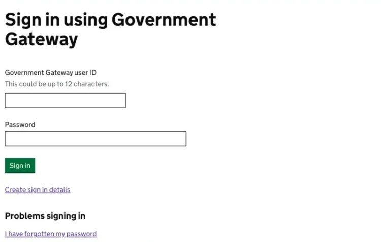
The Government Gateway website allows users to communicate and make transactions with the government from a single point of entry. For example, if you need to file a tax return.
Role
Interaction, Visual design, Prototyping, Testing, Research & facilitation,
I worked alongside a content designer and user researcher. Together we formed the design team. Additionally I worked in a multi-disciplinary team consisting of product managers/owners, developers, testers, architects and business analysts.
Project vision and outcomes
- To create service design that kept the user at the core
- To immerse ourselves in the day-to-day life of businesses,
self employed individuals, accountants and support staff to
figure out what is working and what isn’t - To create a service that is familiar enough for users to
transition easily to the new world, but doesn’t carry over the
pain points of the old world - To increase efficiency within the new help-desk tool with the
aim of shortening support call times - To improve the look and feel of the services, and bring it in
line with GOV.UK patterns and styles

Discovery
As a UX design team travelled all over the country conducting contextual research and spoke to:
- Individuals
- Organisations
- Users from accountancy firms
- Support staff

Pain points
| Tool times out after XX minutes | Busy times can cause slow performance |
| Have to use other tools for advanced functions | A lot of functionality requires repetitive behaviour |
| Users struggle to remember login details | Multiple users result in multiple logins |
| Restricted to certain web browsers | Some technical messages are difficult to understand |
| Accessibility issues | Help section is not helpful |
| Often users don’t realise that their agent would be accessing the service | Users found the old interface difficult and unintuitive |
User needs
| I need… | So that… |
|---|---|
| A service that stays logged in for a long time | I can work uninterrupted |
| Information that is easy to understand | So that I can feedback accurate information to the customer |
| To retrieve information quickly and accurately | I can deal with queries efficiently |
| To deal with customer queries immediately | I do not have to escalate them |
| Enough similarity between the old world and new world | Navigation is intuitive |
| To be able to respond to calls quickly | So that I can resolve customer queries in a timely manner |
| Content that is familiar | So that I have a smoother journey when handling multiple taxes |
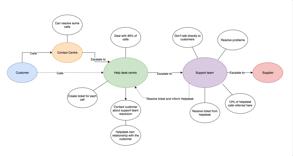
Journey maps
After speaking to our users myself and the researchers created high level process maps and some user journey flows for the project.

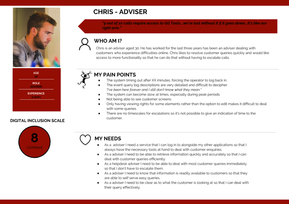
User personas
Personas were created to feed back to the wider teams to generate empathy. The more diverse the personas are and the more perspectives gathered, the easier it will be to design something inclusive.

Challenges
The challenges Each stream was presented with different challenges, to name a few:
- Creating a system that works for both new users and those used to what is already out there
- Clear content strategy
- Balancing language so that it is detailed enough to be useful to the technical teams within the customer support teams for the helpdesk tool
- In contrast, for the public facing service the language needed to be portrayed to everyone remaining inclusive
- Ensuring that the helpdesk tool is useful for various user bases that have different levels of access

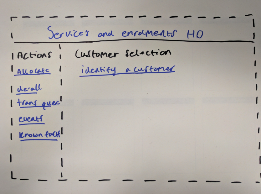
Design and ideation
With insight into the experience myself and the rest of the design team led a workshop to generate ideas that we could convert into prototypes for usability testing.


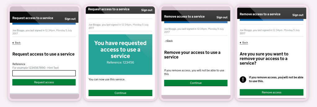
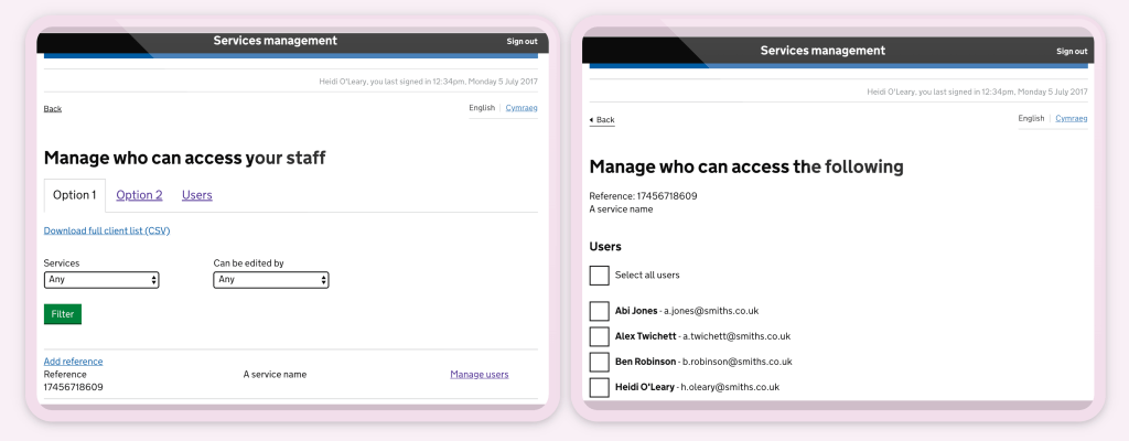
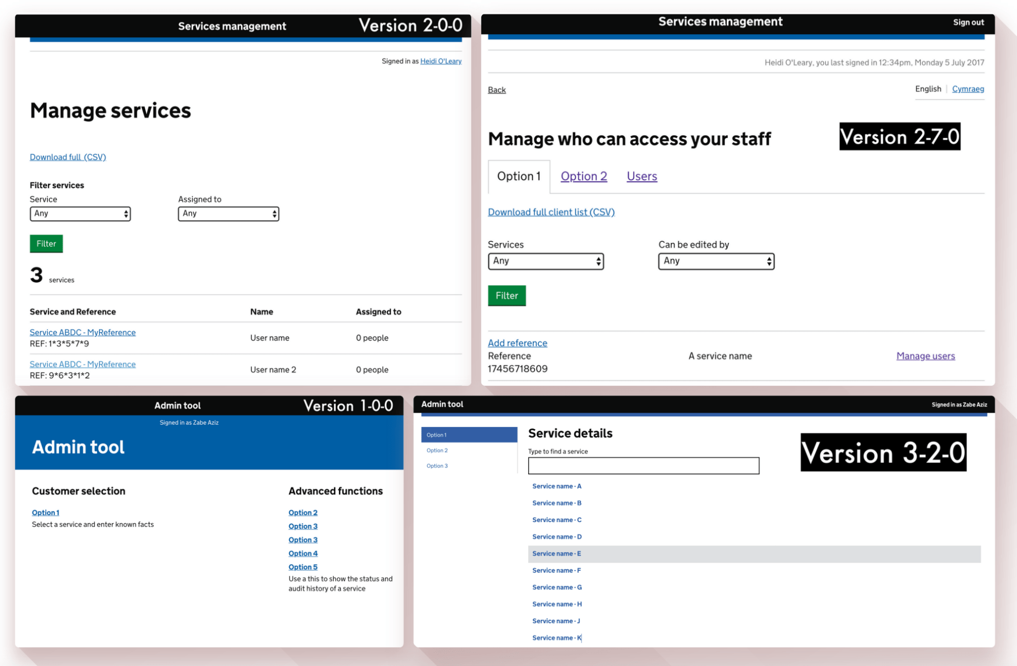
Prototype
High fidelity prototype using the gov.uk prototyping kit.
Single sign on
Managing services online
Admin tool

Usability testing
Testing with the most honest participants.
1:1 Interviews were conducted with various users across the UK. We setup observed usability testing sessions to understand how user behave, interact and react with the products.
8 rounds of testing |
4 users with access needs |
56 total users |
5 users using assistive technology |

Iterating
From every observation, every new requirement, every user need and from listening to our users.
Big wins
No timeout and password
Entry Users had complained that the system timed out after 15 minutes, which caused unnecessary delay during calls and frustration for users.
They also lost a lot of time to resetting passwords as these were auto-generated and hard to remember.
We created a system that hooked into their computer login – no more timeout + no more passwords to remember = lots of time saved.
An accessible service that users were able to migrate to easily.
Shorter journeys By redesigning the layout of the tool, we enabled users to get to the information that they wanted much easier, with far less clicks and pages.
Shorter journeys = calls resolved quicker + increased productivity + happier customers
What users say now
“I like it better It’s clearer and easier to navigate Better than the old tool”
“It’s easier than the previous tools. More straight forward”
“Now they’ve seen it there’s chat about it on the floor today. Straight away they’re coming out and saying ‘oh you should see this and you should see that. which is obviously good”
“The bar all down the side is really easy. You don’t have to restart.”
“The options are very straightforward on the side. Very easy to make out It’s great”
“The bar all down the side is really easy. You don’t have to restart”
“The options being on the left-hand side are a godsend. I think the sooner the better.”
“Really easy It’s common sense where things are”
“The wording here is better than what we’ve got with the current tool. I can’t make heads nor tail of it!”
Let’s work together to create something unique! 👨🏻🎨
Get in touch to discuss opportunities
© Zabe Aziz design 2022
